How to Style a Rose Gold Watch: Proportions, Color, and Form
Learn how to style a rose gold watch with deliberate silhouettes, rich winter textures, and thoughtful metal mixing for everyday creative focus.
Spectrum Editorial · 7 min read · 1 view
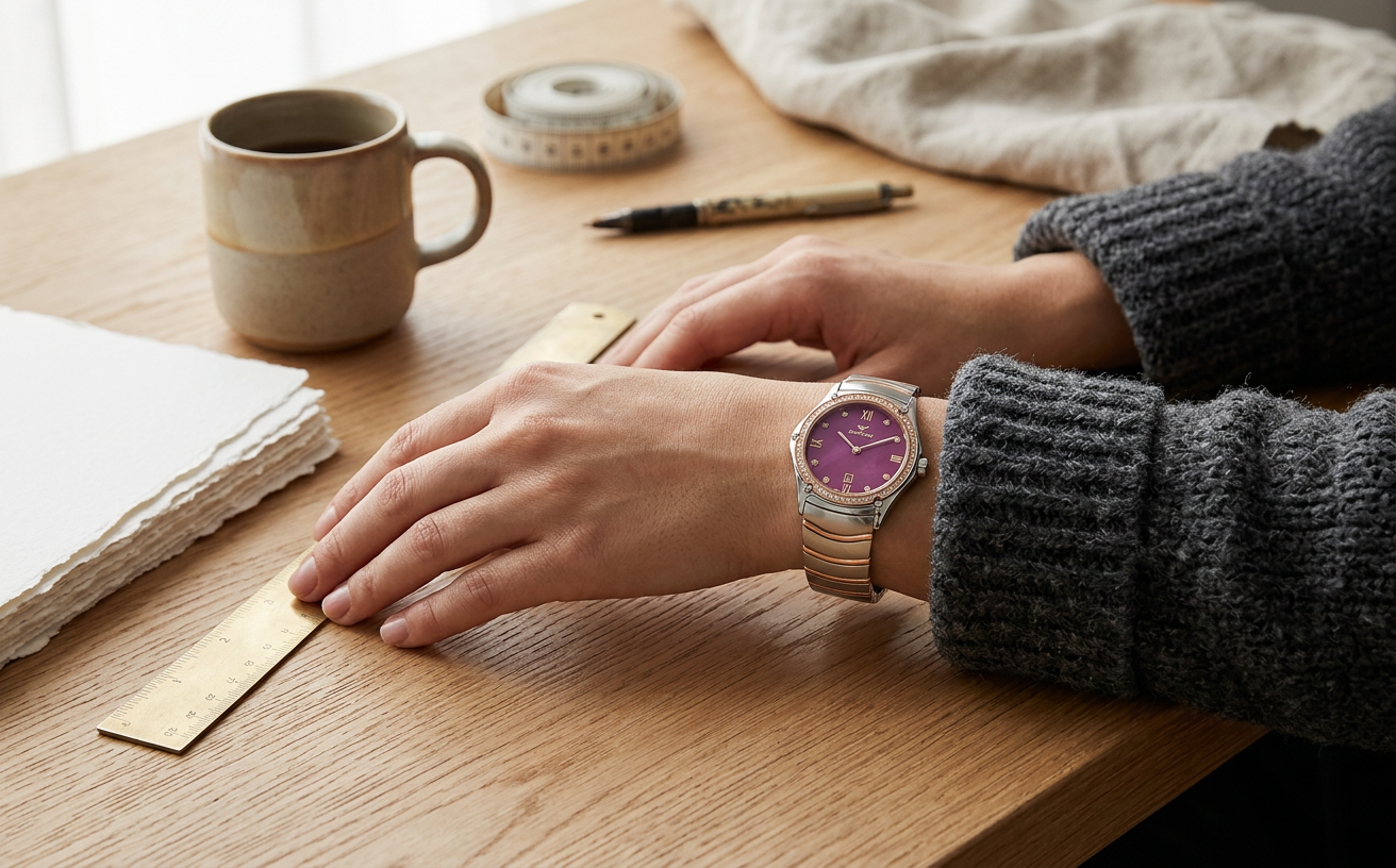
It is 8:15 AM on a mid-November Tuesday in an East London studio. The natural light filtering through the northern warehouse windows is flat, slate-grey, and cold. On the oak worktable sits a fresh stack of uncoated cotton paper, a calibrated drafting ruler, and a steaming ceramic mug of filter coffee. Before you pick up the pencil or open the layout file, you clasp your watch around your wrist. Choosing how to wear a rose gold watch in an environment dedicated to making things is not about ornamental posturing; it is about tactile weight, visual proportion, and the quiet satisfaction of a functional tool that belongs in the room.
For decades, traditional watch media treated warm metal cases as evening-exclusive jewelry. Publications like Hodinkee or Fratello often frame rose finishes through the lens of heavy 18-karat dress watches—precious heirlooms locked away for gallery openings or black-tie dinners. But when you are actively designing, drafting, or editing, you need objects that endure daily friction. A modern rose-tone timepiece built from stainless steel subverts old formal codes, functioning as an anchor for practical, purposeful design.
Finding Intent in the Modern Rose Gold Watch
To wear a rose gold watch without sliding into dated luxury tropes, you have to understand its material construction. Solid gold alloys are dense, soft, and prone to surface gouges when dragged across work surfaces. Spectrum approaches the format through industrial practicality: marine-grade stainless steel treated with a precision this piece ion plating. At an accessible price point under $400, this construction delivers the chromatic warmth of red gold while retaining the tensile strength and dent resistance of a field tool.
Analogue quartz movements bring exact, zero-maintenance discipline to this architecture. You never have to reset the hands after three days away from the drafting board. There are no screens demanding updates, no vibration motors pulling you out of deep focus, and no battery-depletion warnings midway through an afternoon session. An analogue three-hand layout is an intentional boundary. It presents time as a continuous spatial sweep, allowing The Creative to operate without distraction.
When evaluating a piece like the [[product: Women's Gold Watch S17083L|two-tone rose case with a purple dial]], look closely at the interplay of finishes. The cool brushed steel links stabilize the bracelet, while the rose-tone center elements inject controlled warmth. That balance prevents the watch from feeling like an evening bauble. It handles the ambient wear of ceramic dust, book cloth, and metal rulers without demanding precious handling.
Color Theory: Pairing Rose-Plated Steel with Saturated Dials
Warm metals inherently pull red, copper, and yellow undertones to the surface. When paired with standard white or champagne dials, this piece cases risk blending into conventional heritage aesthetics. The addition of a deep, saturated purple dial alters the equation entirely.
Purple and yellow sit directly opposite one another on the artist’s color wheel. Because rose gold contains subtle brass and yellow hues beneath its copper blush, a rich violet or aubergine dial creates a high-tension complementary dynamic. It turns the watch face into a deliberate graphic object. The dial absorbs glare, offering legible contrast against polished applied indices and slender baton hands.
To see how this works across varied case shapes, examine how [[product: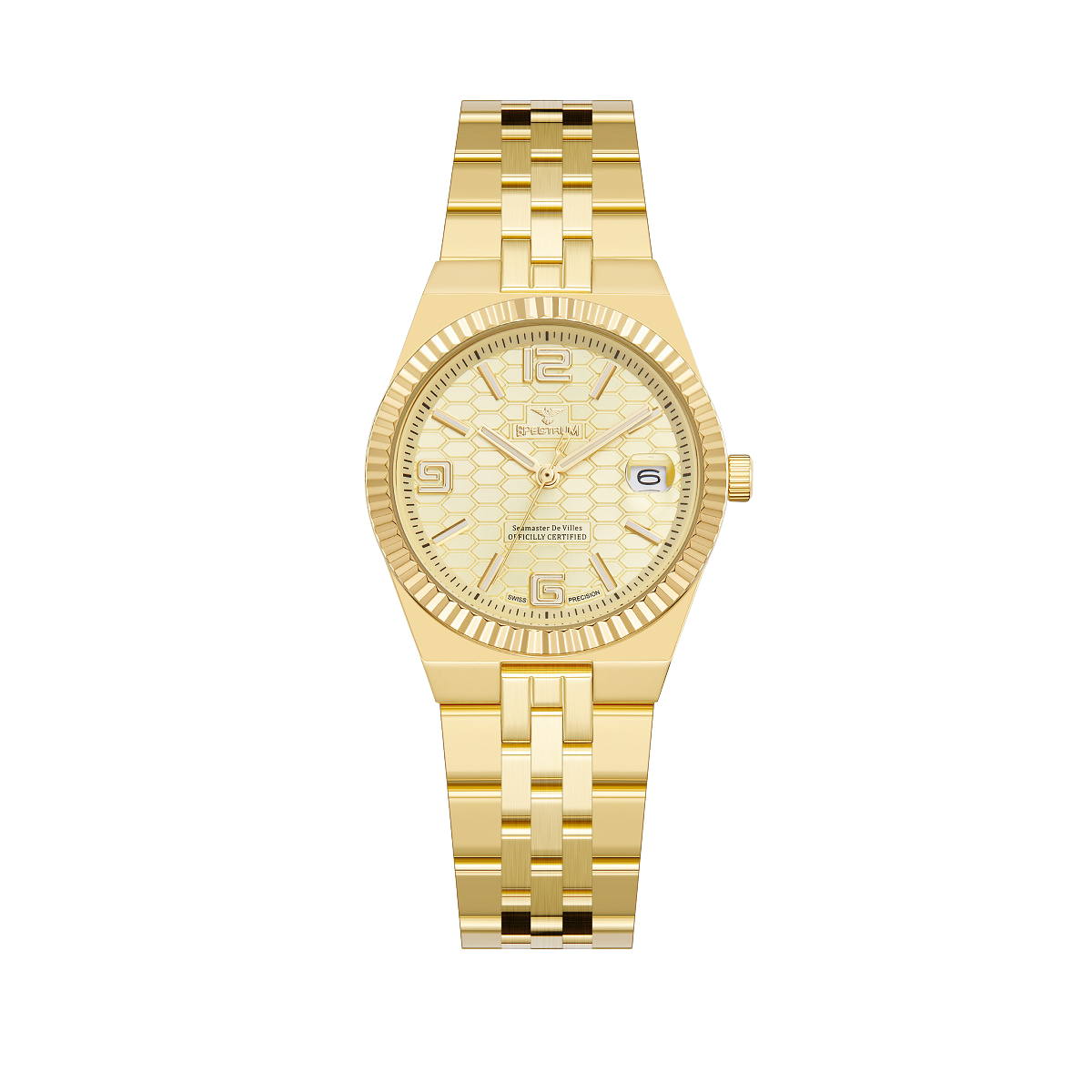 Women's Two Tone Gold Watch S17107L|a geometric two-tone steel bracelet]] directs the eye. Linear brushwork across the lug hoods breaks up specular highlights, keeping the watch grounded even under harsh fluorescent studio fixtures or low winter sun. The deep jewel tone does not look decorative; it looks engineered, like an anodized camera dial or a bespoke fountain pen casing.
Consider how this palette interacts with your natural skin tone:
- Cool Undertones: The silver-toned steel sections of a two-tone bracelet reflect the cool hues in your wrist, while the rose elements provide energetic contrast without appearing sallow.
- Warm Undertones: The copper-flushed bezel echoes natural olive or golden pigments, letting the purple dial serve as a sharp, deliberate point of tension.
- Neutral Undertones: You have total freedom; the mix of cool steel and warm plating allows you to wear either silver-cast or bronze-toned workwear accessories without visual conflict.
Architectural Layers: Outfit Pairings for Studio and Street
Styling a warm-toned steel watch during late autumn requires a foundational understanding of silhouette and tactile weight. If your clothing is too delicate, a steel bracelet overpowers the cuff. If your layers are purely technical sportswear, the rose plating looks incongruous. The solution lies in structured, textural utility.
Begin with the trouser. The Sorte Deep Pleat Pant from Studio Nicholson offers the wide, architectural leg line favored by contemporary makers. Cut from heavyweight peached cotton twill in deep navy, the fabric provides a dense, matte foundation. Navy sits in natural harmony with both rose tones and purple accents, creating a chromatic link between wrist and hemline.
For knitwear, look to Lemaire’s seamless rollnecks in deep espresso or bitter chocolate brown. Earthy, roasted browns bridge the gap between warm metallic plating and cooler textiles. A fine-gauge merino wool knit clings cleanly to the wrist, creating an uninterrupted backdrop when your sleeve pulls back as you reach across an easel or turn the focus ring on a manual lens.
Outerwear completes the silhouette. Margaret Howell’s boxy overshirts in slate-grey milled wool introduce utilitarian precision. The dry, textured weave of charcoal wool softens the reflective surfaces of the watch case. When you fold back the heavy wool cuff, the juxtaposition between coarse shorn fleece and smooth, cold stainless steel feels deliberate and self-assured. If your wardrobe leans toward lighter monochrome palettes, exploring different style profiles will help you pair structural tailoring with contrasting metal tones.
Mixing Metals and Materials: Skin Tones, Jewelry, and Daily Wear
One of the most persistent myths in personal styling is the prohibition against mixing metals. Traditional guides often suggest that if your watch case features rose tones, your belt buckles, rings, and eyewear must follow suit. In actual creative practice, rigid uniformity feels flat and corporate.
A two-tone watch is fundamentally an invitation to break matching sets. Because the chassis combines cool stainless steel with this piece accents, it forms a visual bridge between disparate objects. You can comfortably wear a heavy sterling silver signet ring on the index finger of the same hand. The silver mirrors the exterior bracelet links, while the rose bezel frames the dial independently.
When selecting optical frames, consider raw Japanese titanium or matte black acetate. High-gloss yellow-gold frames can over-saturate your face when combined with warm wrist hardware. Matte titanium, gunmetal, or transparent grey crystal frames keep the visual weight distributed evenly across your body.
Pay attention to the hardware on your daily gear. If your canvas field bag features nickel rivets and solid-brass zipper pulls, your watch should sit comfortably between them. An analogue quartz watch on an engineered steel band does not demand curation; it effortlessly mediates between the tools you use and the clothes you wear.
Day to Evening: The Functional Shift from Making to Showing
Creative schedules rarely split cleanly between this piece desk hours and evening socializing. A typical Thursday might involve five hours of dusty screenprinting or kitchen prep, followed directly by an impromptu exhibition walk-through or a client dinner across town. Your wristwear has to make that transition without requiring a detour back to your apartment.
A stainless-steel quartz watch excels in these transitional hours. A diver like a Seiko SKX007 or a tool watch like a Hamilton Khaki Field can sometimes read as overly utilitarian when stepping into an upscale gallery space. Conversely, an ultra-thin dress watch on a glossy alligator strap looks out of place next to work boots and selvedge denim. The hybrid nature of rose-tone steel hits the precise midpoint: robust enough for the workshop, refined enough for low-lit dining rooms.
When shifting into an evening context, you do not need to change the watch; you simply shed the outer utilitarian layer. Removing a heavy wool overshirt reveals the fine-gauge rollneck underneath. Under warm halogen spot lamps, the purple dial deepens toward black, while the polished rose-tone bezel catches directional light. For those who prefer a slightly more traditional metallic split, [[product: Women's Gold Watch S17099L|a clean this piece profile]] offers similar versatility across diverse lighting conditions.
The durability of ion-plated steel ensures that the transition is worry-free. You do not have to stress over accidental bumps against gallery door frames or zinc bar tops. The watch keeps pace with your movement, tracking the evening’s conversations with silent, steady quartz precision.
The Object on Your Wrist
Watches are, at their best, physical representations of how we choose to spend our finite hours. For individuals who shape raw materials into finished projects, every object carried through the day should earn its place through craft, proportion, and honesty.
A rose-tone timepiece does not need to evoke historic bank vaults or red-carpet galas. When rendered in solid steel, equipped with reliable quartz timekeeping, and contrasted with unexpected dial colors, it becomes an indispensable component of your working uniform. Wear it firmly against your wrist, pair it with structured, honest fabrics, and let it measure the hours you spend making something only you could make.
About the author
Spectrum Editorial
The Spectrum Watches editorial desk
The Spectrum editorial desk — fact-checked, persona-mapped, and written for people who measure life in moments.
Style it with
The outfit
Studio Nicholson
Sorte Deep Pleat Volume Pant in Dark Navy
Architectural volume balances the polished finish of the two-tone case without competing for attention.
Lemaire
Seamless Fine Wool Rollneck in Espresso
A dense, low-sheen knit absorbs studio light and allows the saturated purple dial to emerge as a deliberate focal point.
Margaret Howell
Milled Wool Boxy Overshirt in Slate Grey
Structured utilitarian tailoring cuts against the warmth of the rose-tone plating for an intentional, uncluttered finish.
Wear the story